Primary Colours
Beyond the logo, colours are one of the most recognisable aspect of a brand identity.
The primary brand palette is composed of 2 colours – Prussian Blue and Salmon
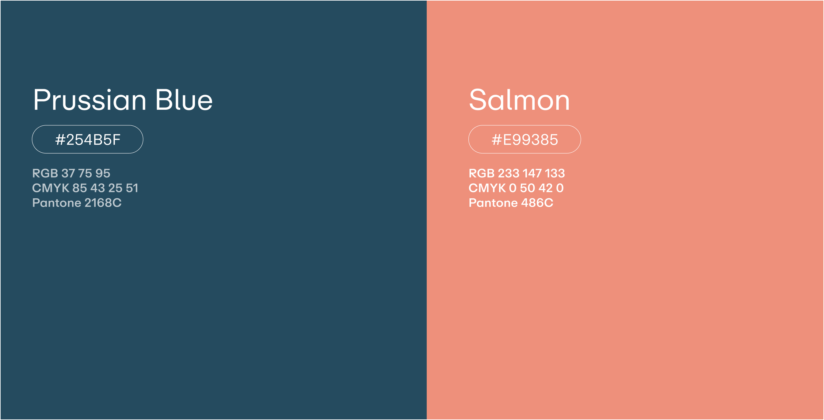
The cool and sophisticated Prussian Blue
is a beautiful shade of blue that signifies trustworthiness and strength.
When paired with Salmon, it creates a unique juxtaposition of trustworthiness and vibrancy.
Salmon is a lively and playful colour that exudes warmth and positivity.
It’s a delicate hue that combines the energy of orange with the softness of pink,
creating a vibrant and cheerful tone.
The colour’s vibrancy gives it a sense of liveliness and dynamism.

Secondary Colours
Our secondary palette offers a diverse
range of brand colours to add flair,
specifically for table headers, data visualisation,
card backgrounds, and iconography.
Status Indicators
Our accent palette includes a selection of
vibrant colours designed to support our core palette.
These colours are tailored for status indicators:
each colour comes in two shades —
a vibrant one to highlight text statuses
and a milder tone ideal for background indicators..
Colour Combinations
Below are the approved colour combinations for the GROW brand.
Always refer to this list of approved colour combinations when creating any digital or print artwork.
Things to avoid
For the purposes of consistency and legibility across our brand,
there are certain colour usage situations that should be avoided
when using our core and secondary palette.
