GROW Logo
This is a representation of who we are and what we stand for.
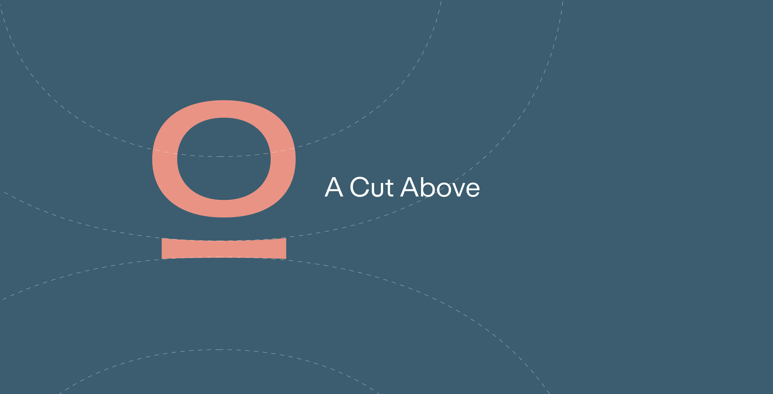
The stylised “O”, represents “A Cut Above”,
and signifies how we enable our advisors to be ahead and
stay ahead in the financial industry.
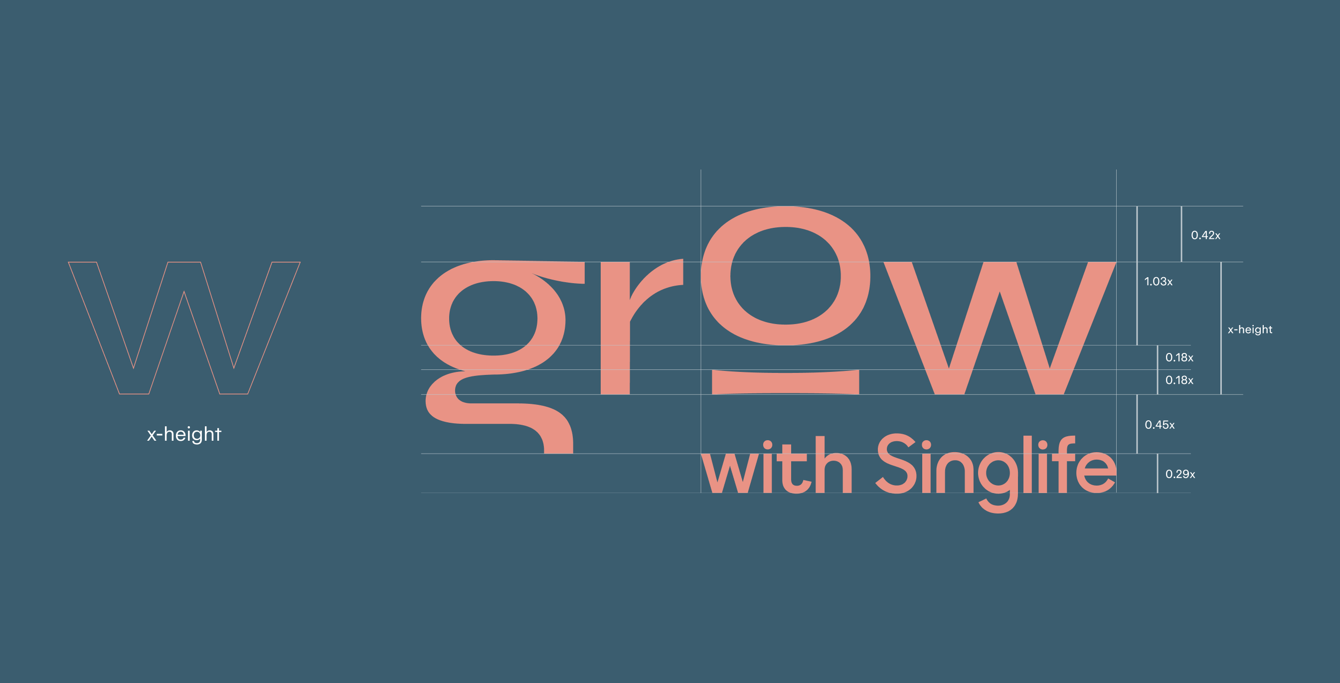
Optimal Visual Balance and Clearance Space
The Grow with Singlife logo has been carefully constructed to create optimal visual balance.
X-height, as defined by “W”,
determines the proportion of the entire logo.
The logo should never be recreated, adjusted or reassembled.
The logo minimum size is specified at ≥ 18mm (width) for print
and ≥ 65px (width) for screen.
![]()
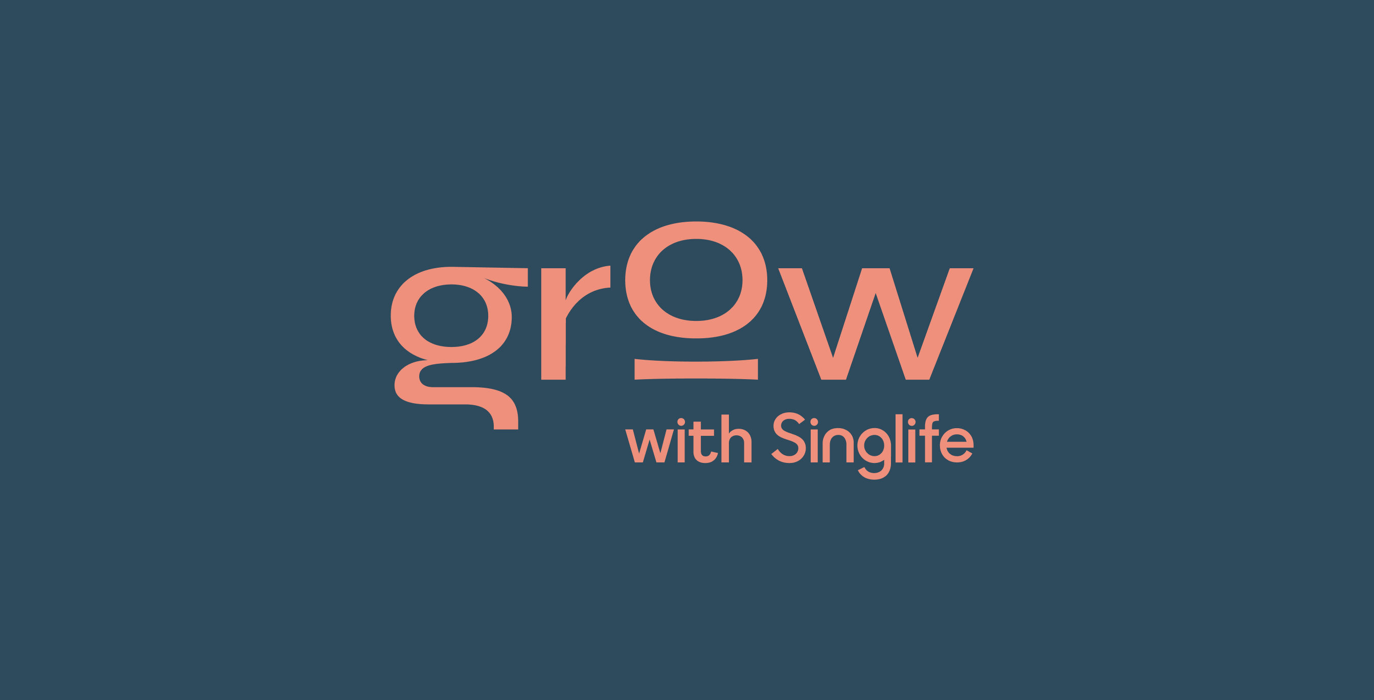
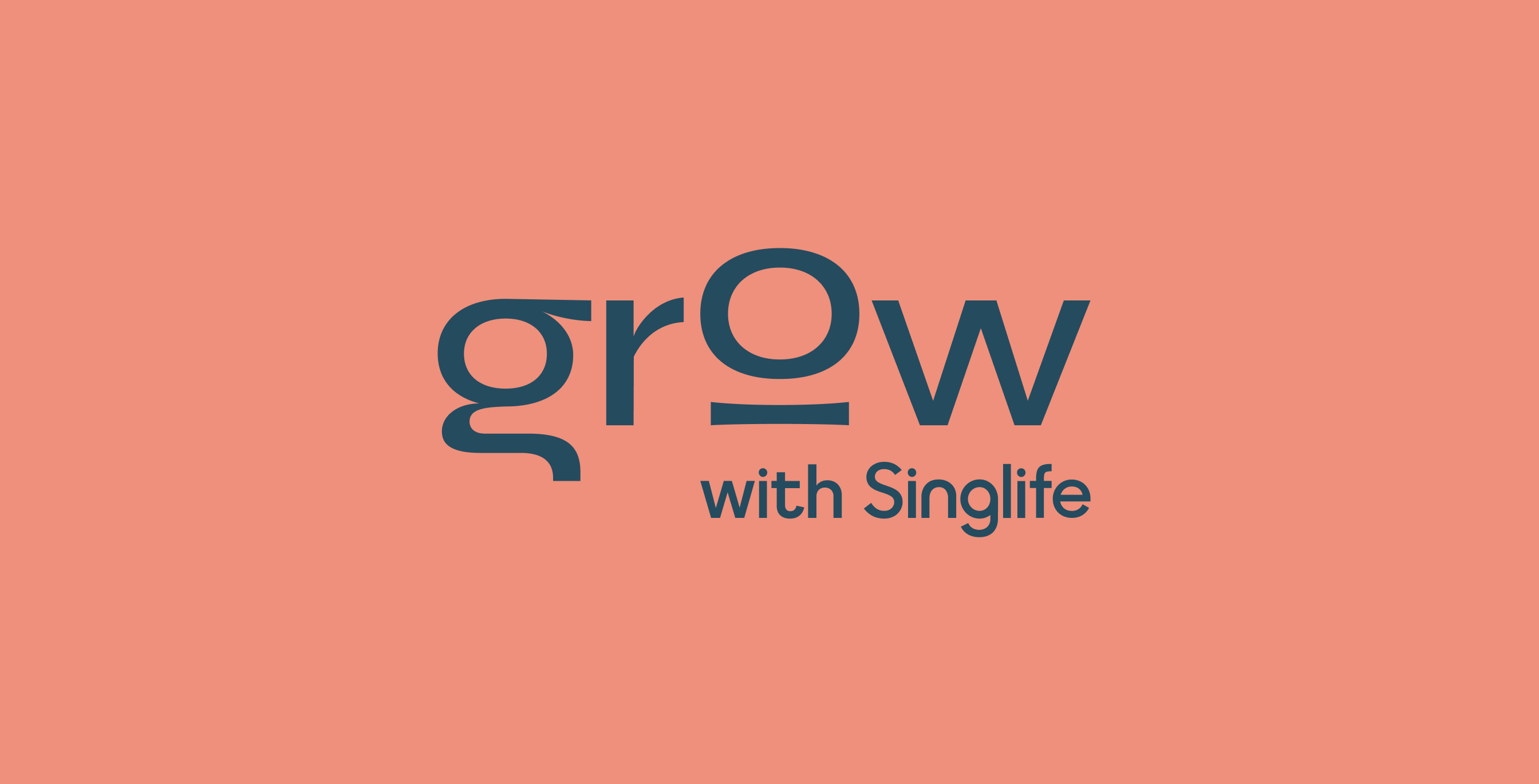
Logo in Primary Colours
For GROW, Prussian blue and salmon are our signature shades.
We employ them from start to finish,
defining our every interaction.
Logo in Secondary Colours
Our secondary palette contains a variety of colours
to keep things fresh and interesting.
Logo in Monochrome
There may be certain circumstances where using the full-coloured logo is not possible.
Under these circumstances, the black and white logo may be used..
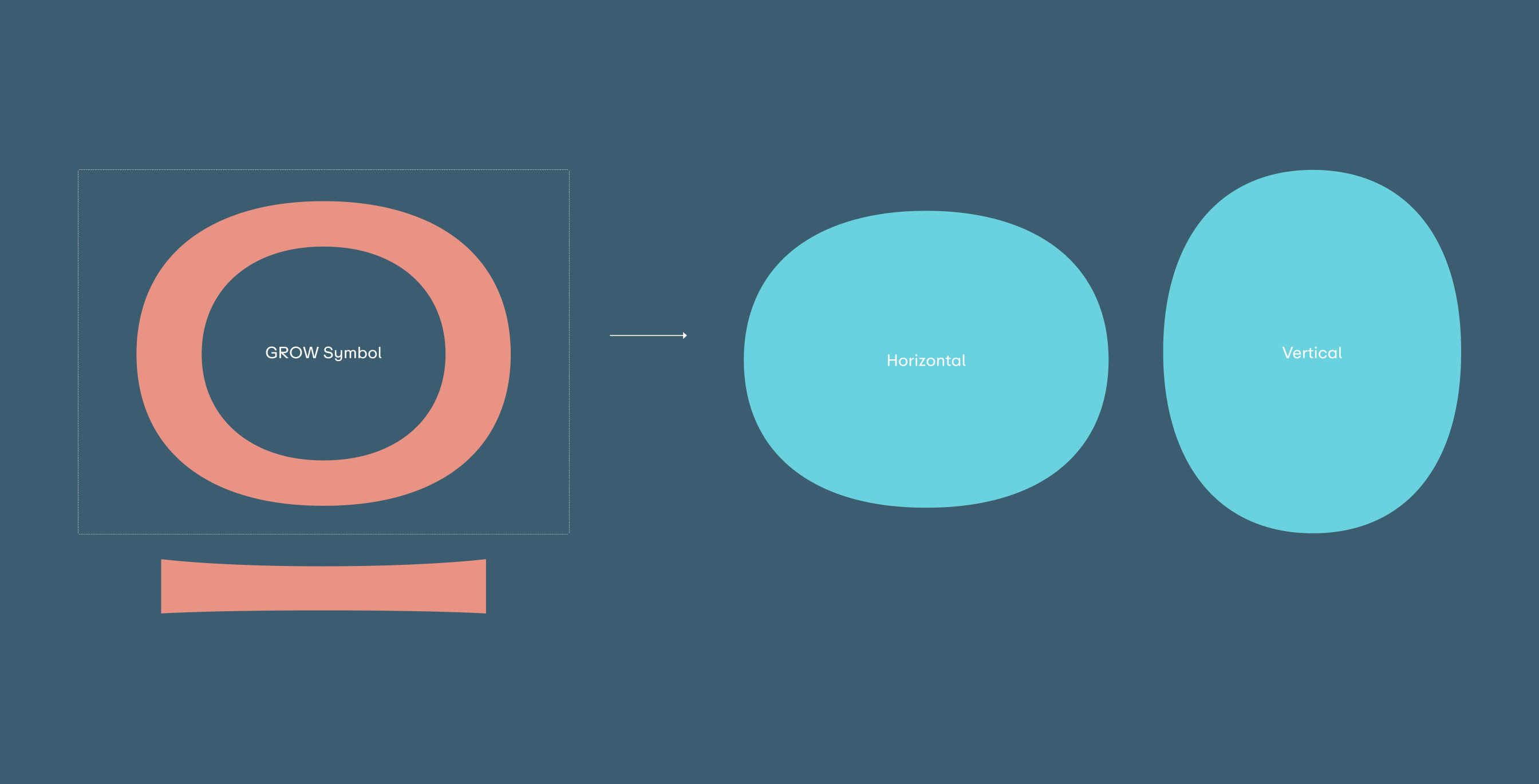
GROW Symbol
Our brand symbol represents what we stand for and has been designed
with the brand mission and vision in mind.
It’s a representation of who we are and what we believe in.
This graphic device serves as a binding thread
that ties all our brand communications together.
Symbol Clearance
The Grow with Singlife logo has been
carefully constructed to create optimal visual balance.
X-height, as defined by “W”,
determines the proportion of the entire logo.
The symbol has an all round clear space of 1x.
![]()
Partnership Lockup and Placement
Our partner lockup is a way of showcasing our great relationships
with other brands and features either our Marketing badge or Logotype.
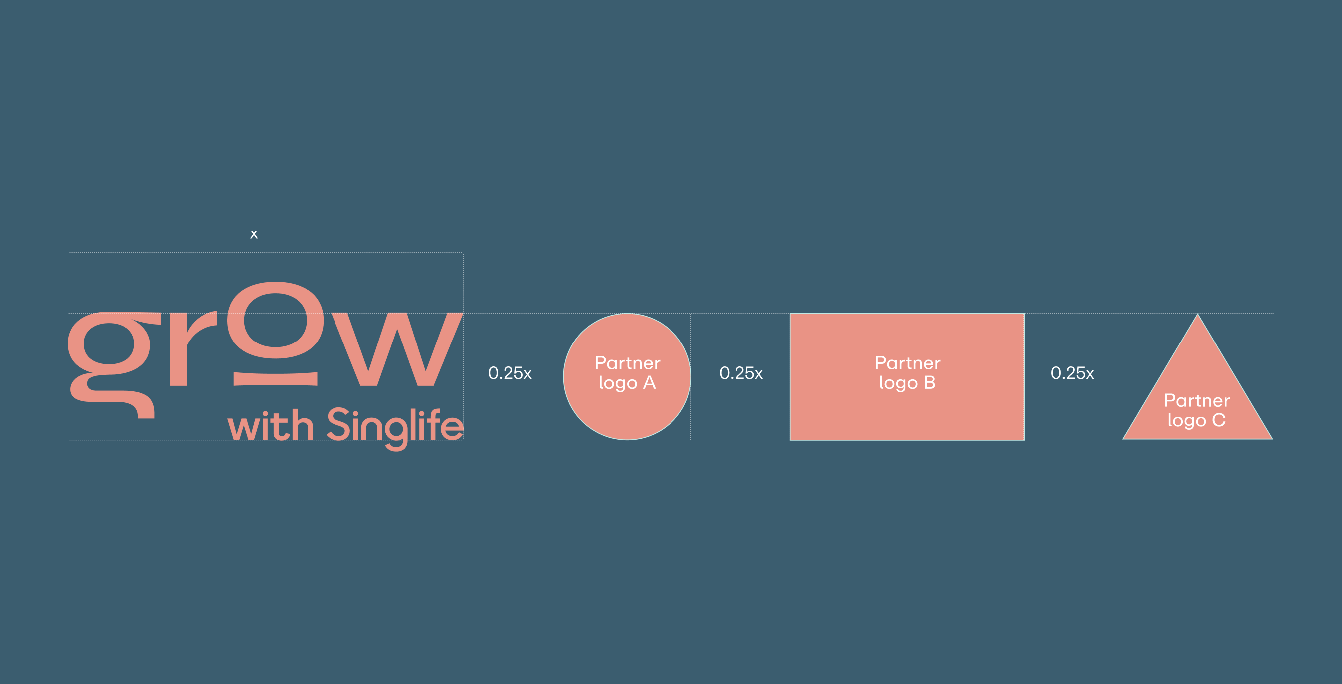
For partnerships, we always start with our GROW logo,
before optically sizing and centering our partner logos to
achieve visual balance between both logos’ proportions.
There may be times where the GROW with Singlife logo
has to appear beside a partner logo.
To ensure that our logo maintains visual prominence,
a minimum clear space of 0.25x has to be maintained between each logo.
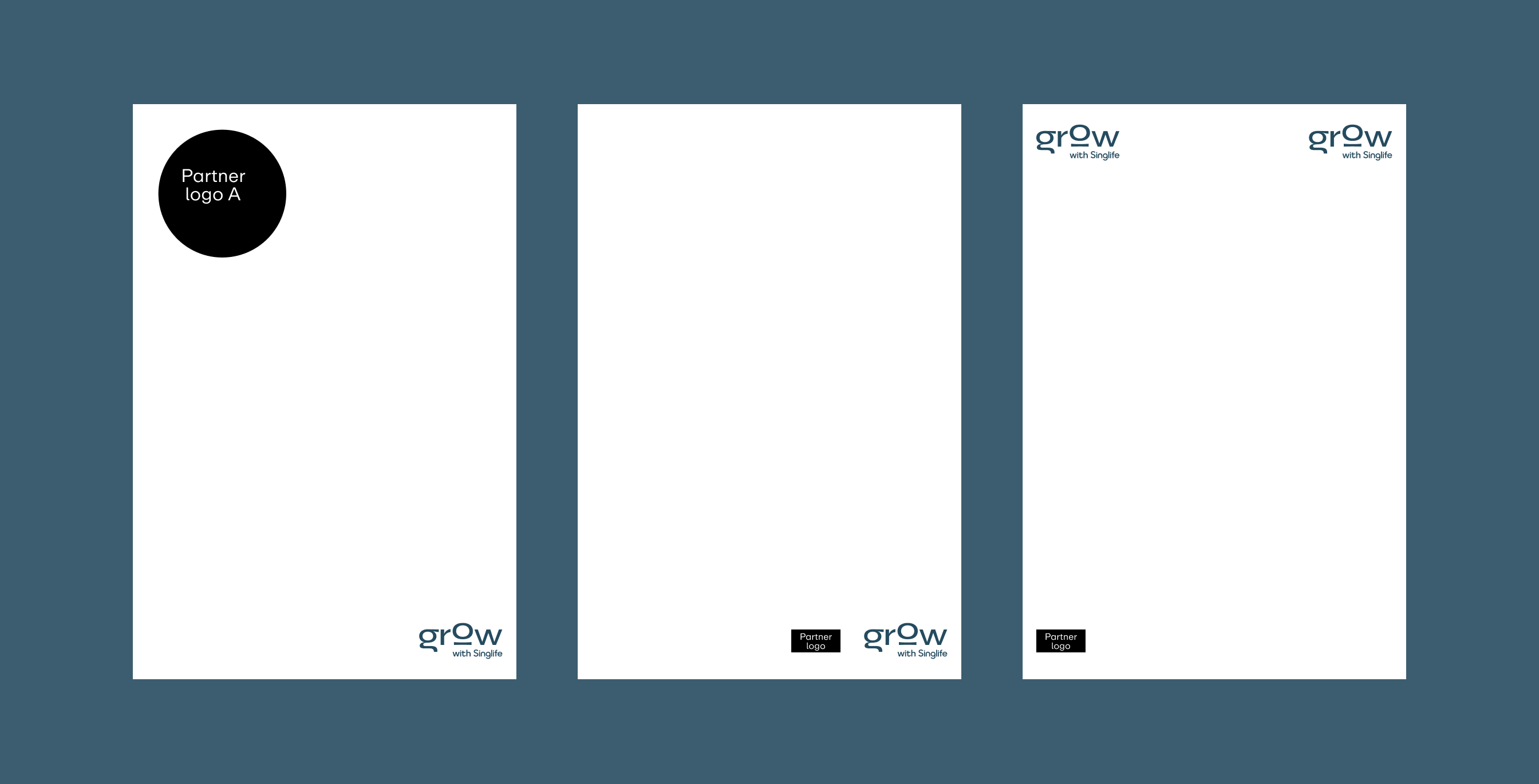
Using the right brand mark
The GROW with Singlife logo should always appear before the GROW symbol.
It should always be the primary identifier of the brand.
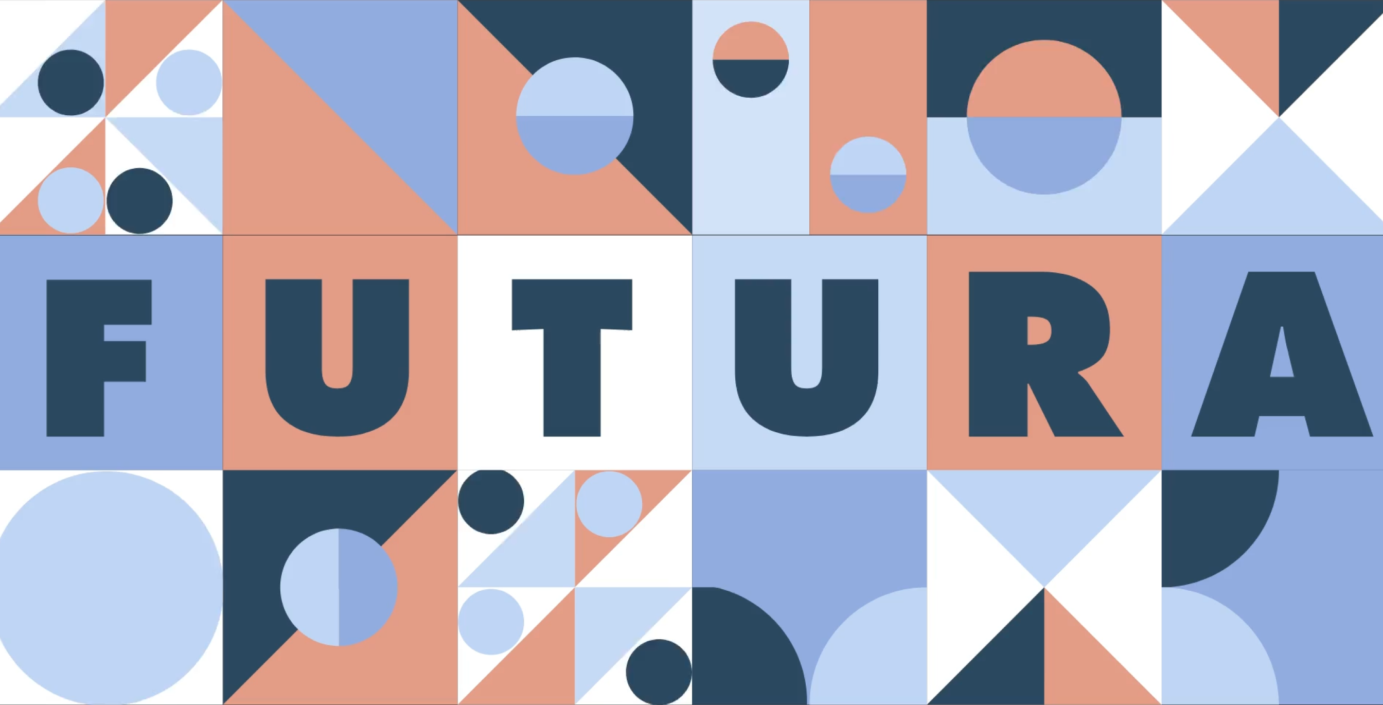
Graphic Device
and Shapes
Our graphic device is inspired by the GROW symbol.
It symbolises what we stand for and has been designed
with the brand mission and vision in mind.
Construction
The GROW brand's graphic device is versatile
and can be utilised in numerous creative ways.
You have the freedom to slice, mask, and stack them to achieve the desired effect.
When integrating the GROW graphic device into any design,
always adhere to these three core principles.
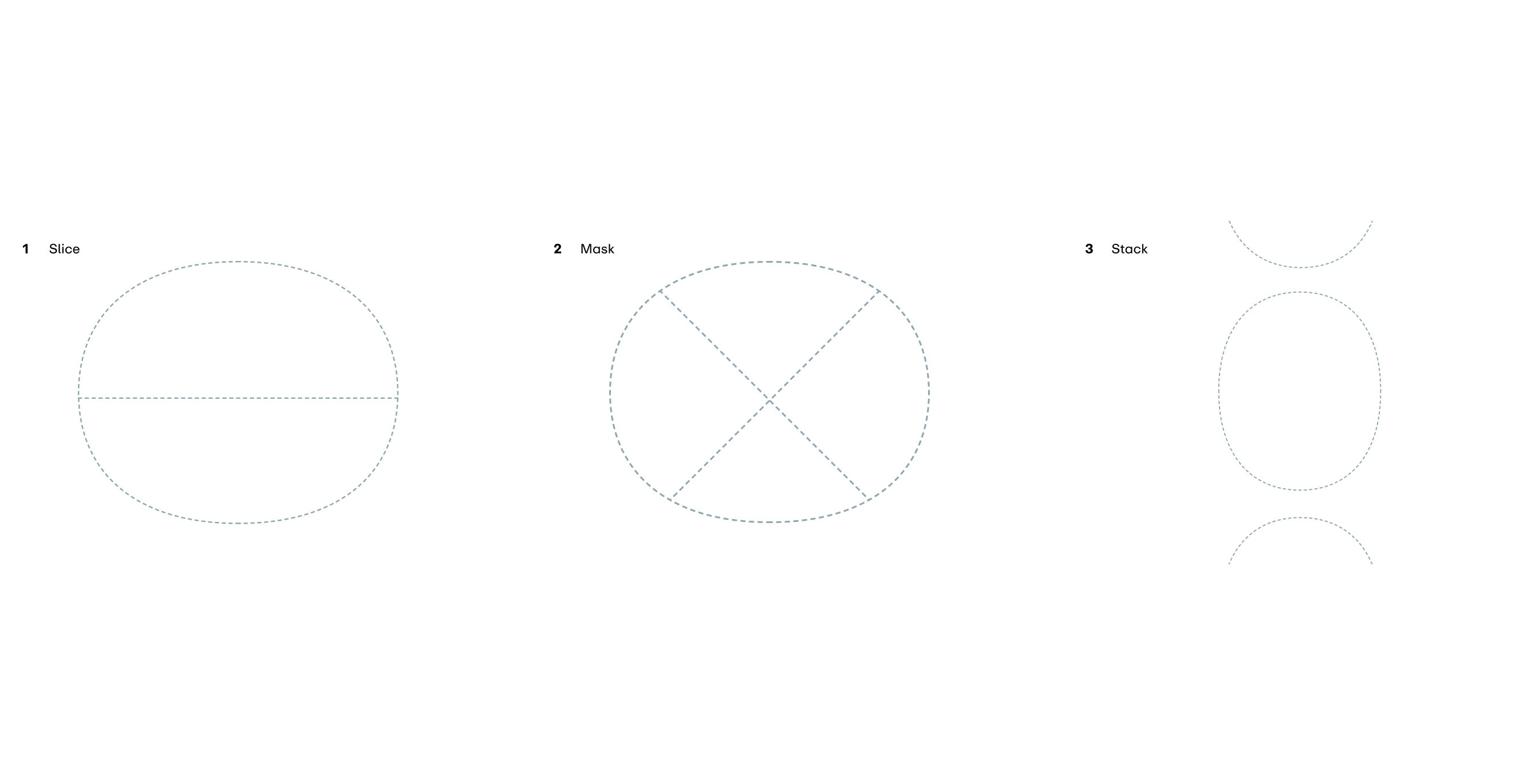
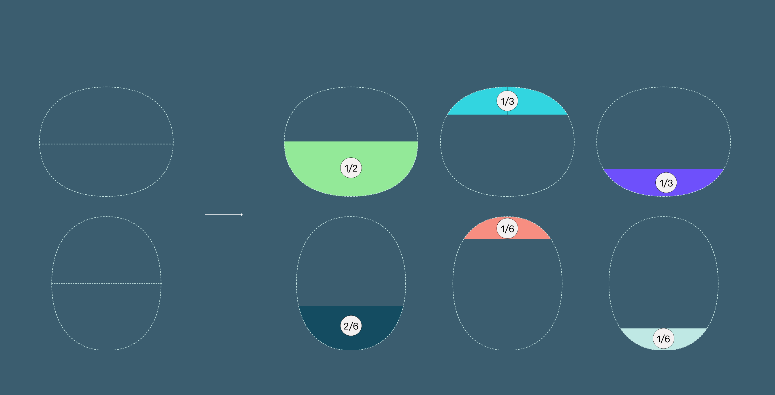
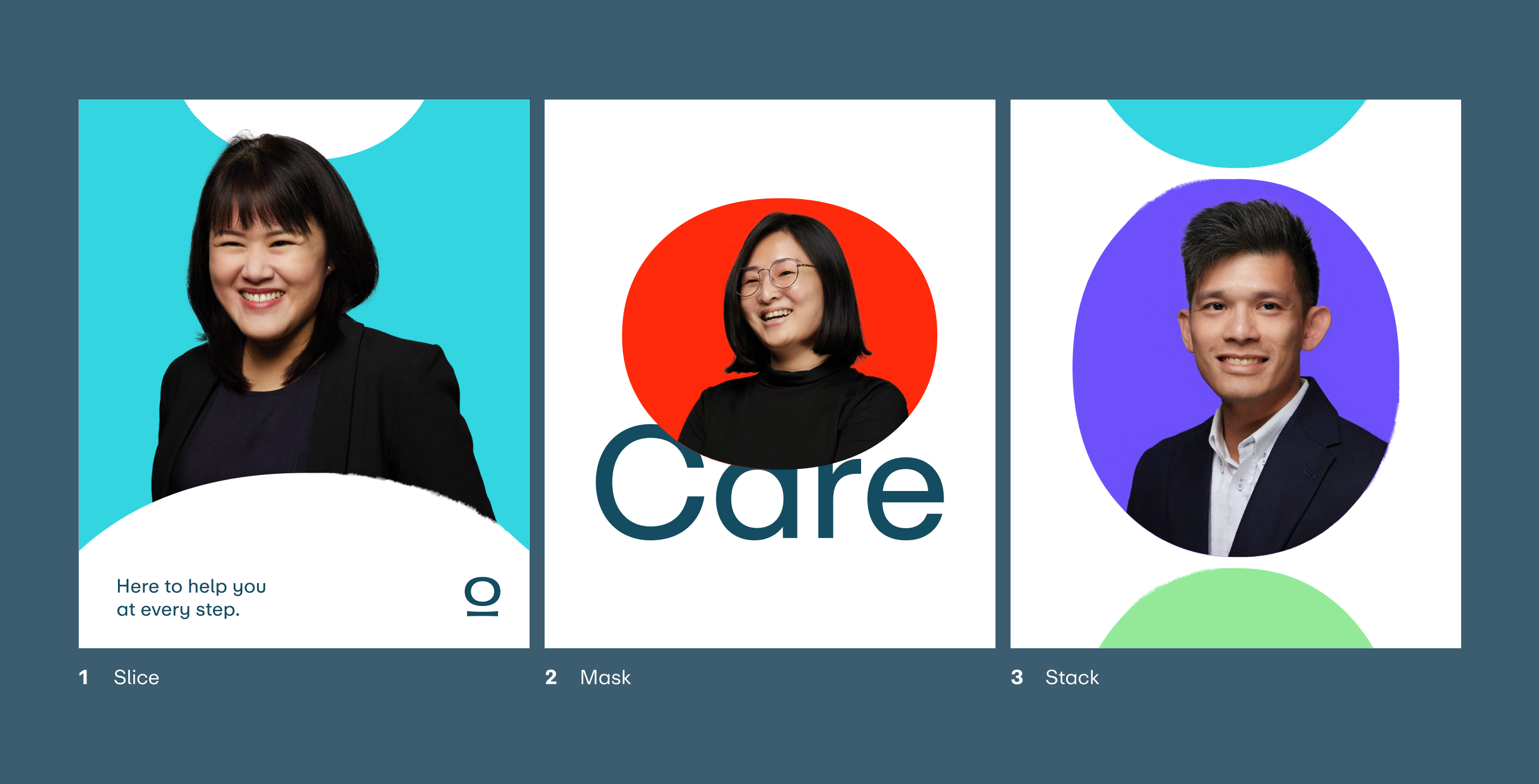
Slice
At GROW, our distinctive graphic device showcases
versatility through varied slicing techniques.
The "O" can be innovatively partitioned in diverse ways,
including halves, thirds, and sixths,
exemplifying our brand's adaptability and dynamic visual language.
Mask
At GROW, our unique graphic device extends
its utility by serving as an artistic mask for images.
This technique particularly accentuates people-focused visuals,
turning standard portraits and profile shots
into intriguing and brand-consistent visual statements.

Stack
GROW introduces a versatile stacking approach with its graphic device.
Drawing inspiration from the ethos of "A cut above",
the design enables the fusion of a complete shape with individual slices.

Usage Example
Things to avoid when using Graphic Device
Avoid filling the entire media with the graphic device.
Ensure it's stacked vertically and
refrain from cropping it too closely.
Shapes
As an extension to the GROW visual identity system,
various GROW shapes have been created,
adding more dynamism and flexibility to the brand system.
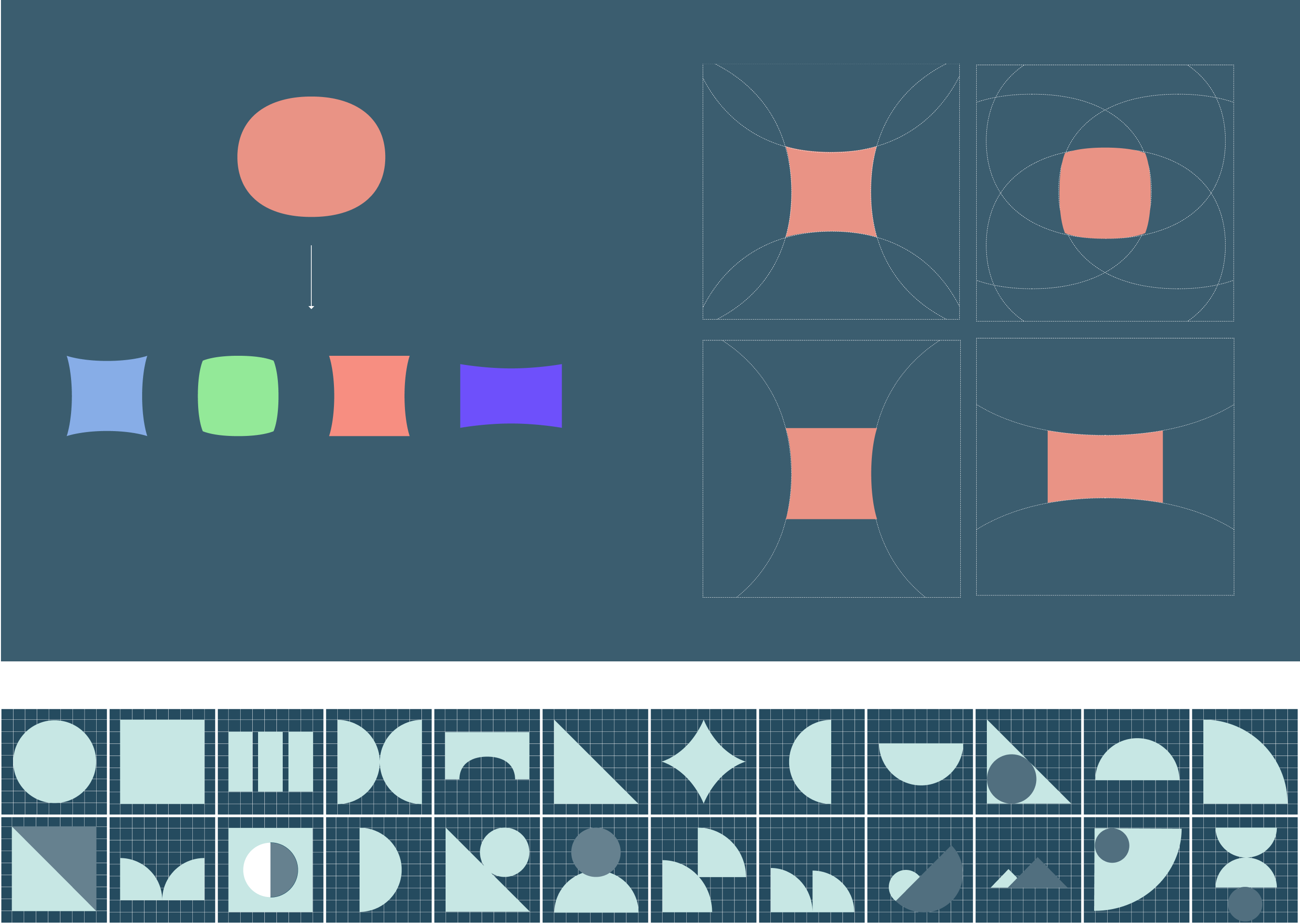
Shapes usage example