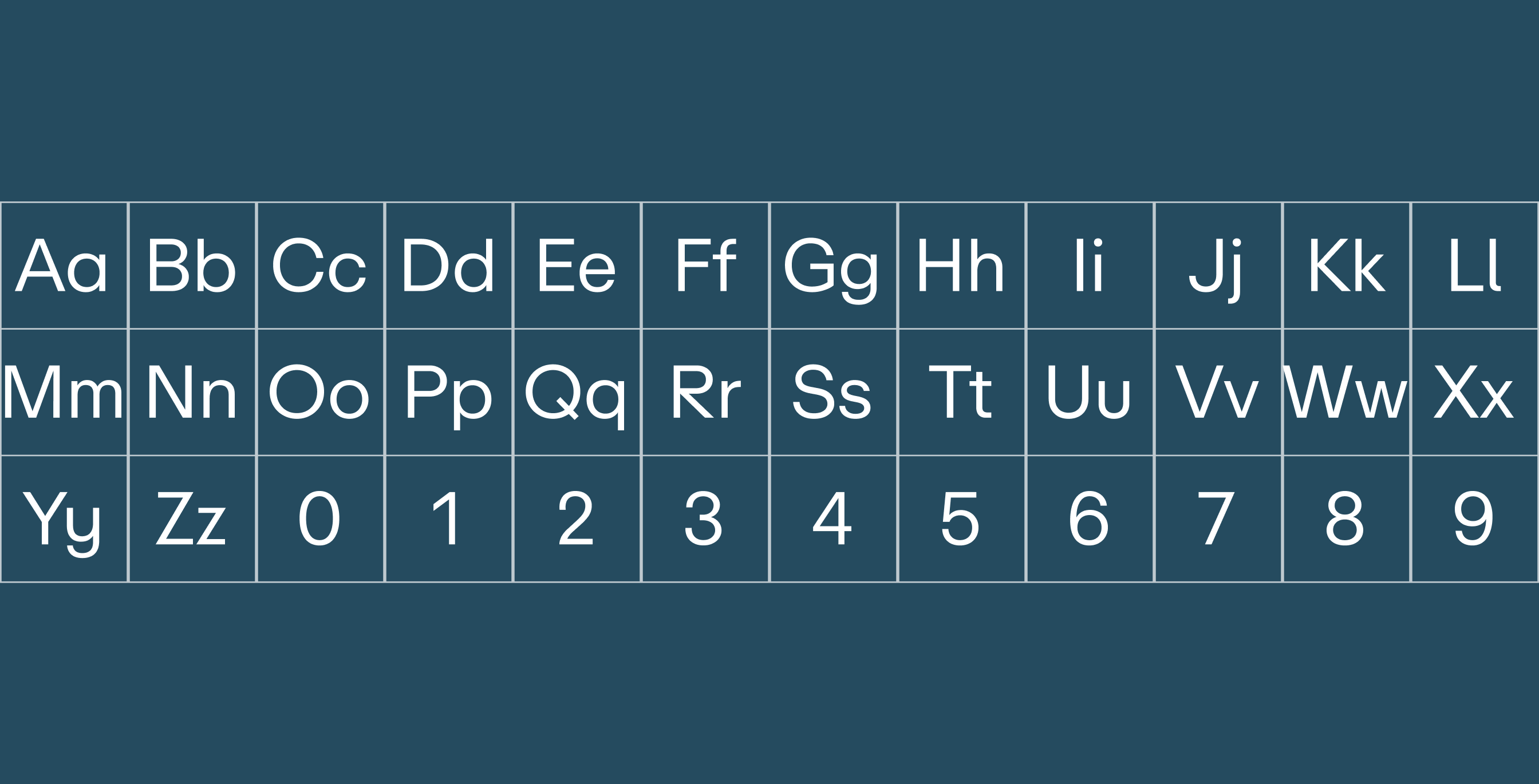
Primary Typeface
ABC Repro is a modern and versatile font
designed for clear and effective communication.
It also adds a touch of professionalism and
clarity to any design.

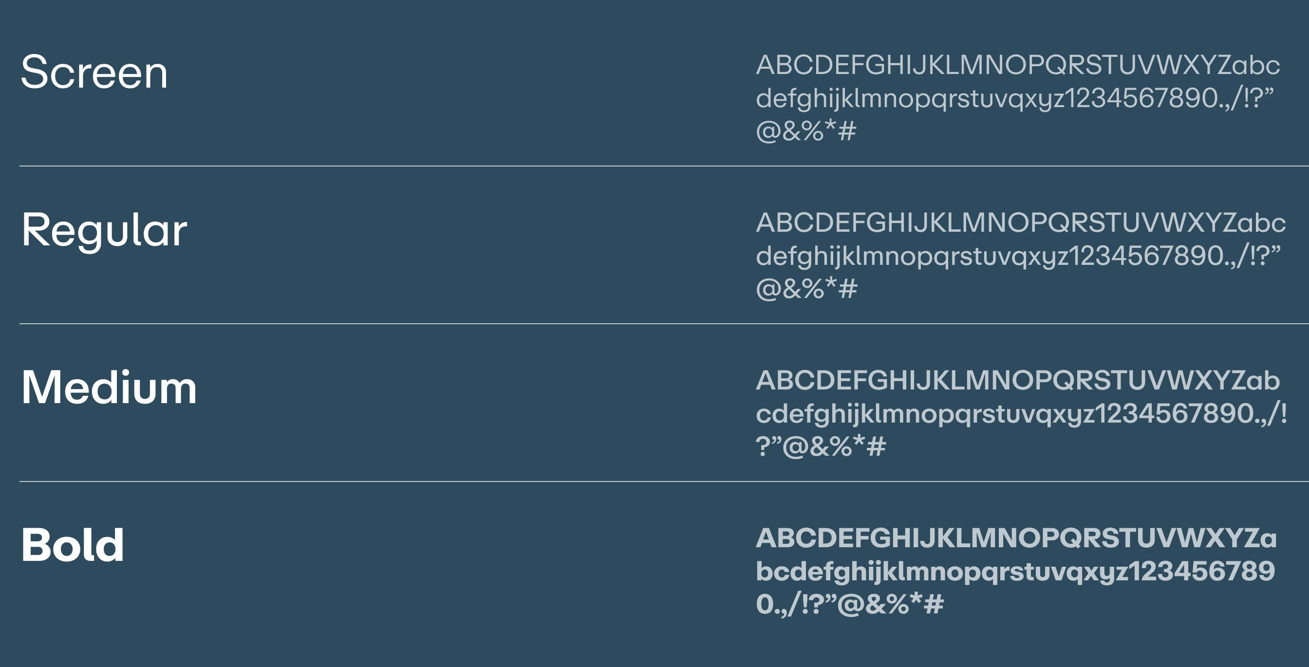
Type Setting
ABC Repro can be used for headlines, subheads and body copy.
We have indicated kerning and leading specifications
in the examples below to keep the typeface usage consistent.

Headlines can be in ABC Repro Regular for print applications.
ABC Repro Screen or Regular can be used for subheads and body copy.
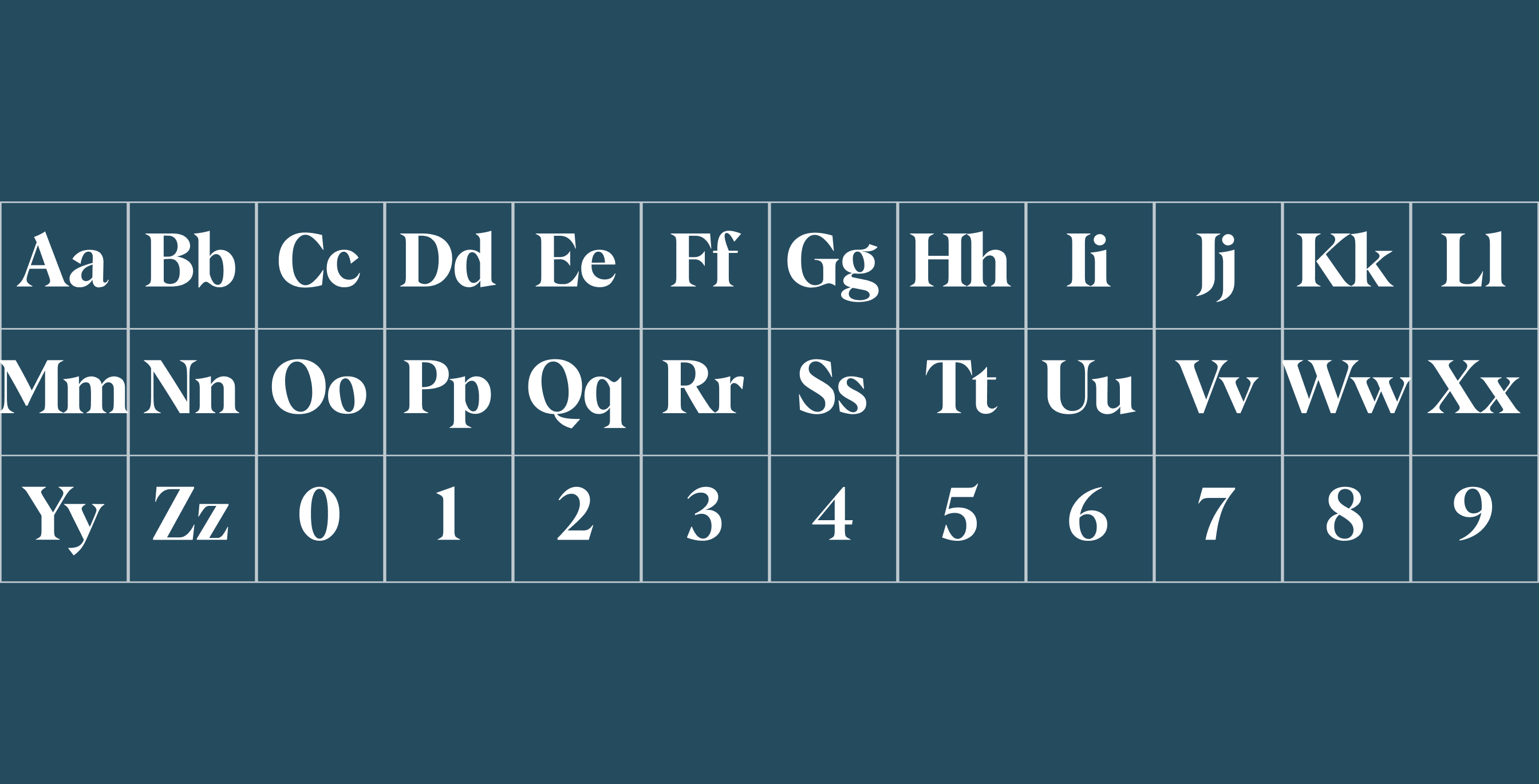
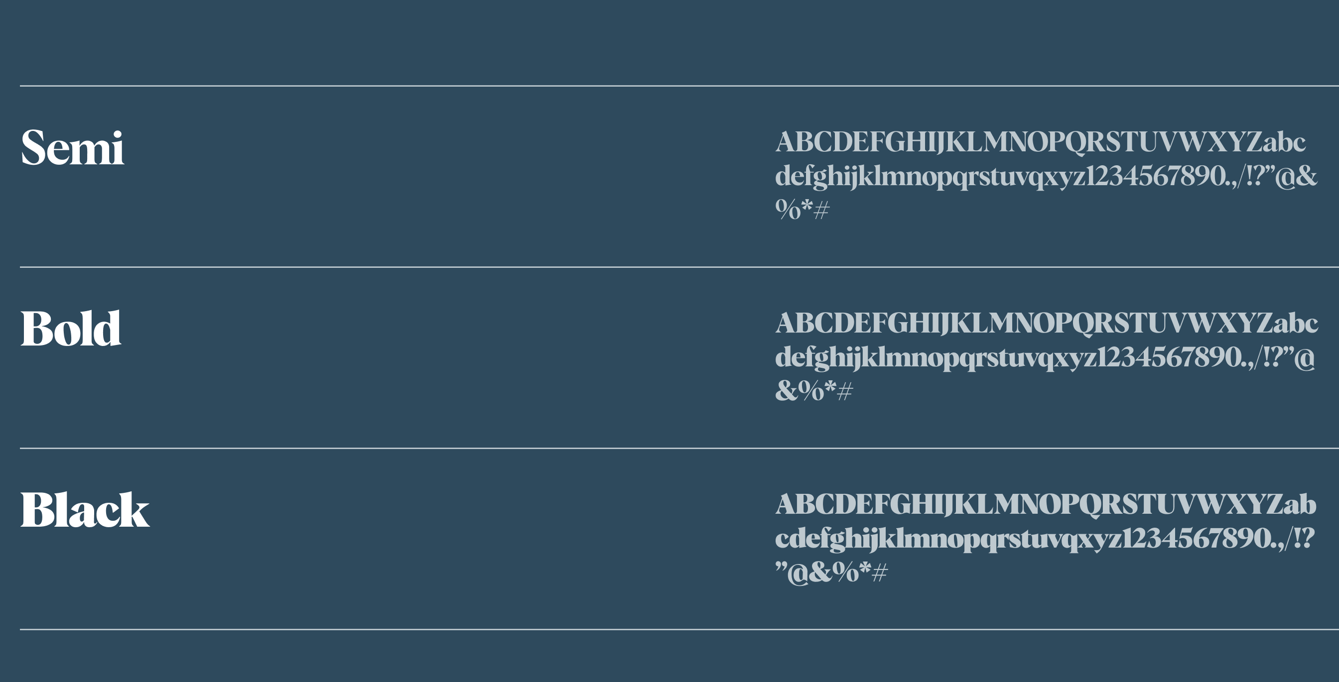
Secondary Typeface
We've chosen Albra as our secondary typeface
specifically for its standout clarity in print.
Its distinctive features shine in headlines,
ensuring optimal visibility and
reinforcing our commitment to clear communication.
It also adds a touch of professionalism
and clarity to any design.

Type Setting
Albra and it’s font weights can be used in contrast
with the Primary typeface, ABC Repro.
It can be used to brand taglines,
as demonstrated below.
Typographic mix in use
Here’s a range of examples that show how
to use and mix together
our brand typefaces effectively.
Text Alignment
All typography should only be aligned in 2 ways:
left or center-aligned.
Justified or right alignment is never acceptable.
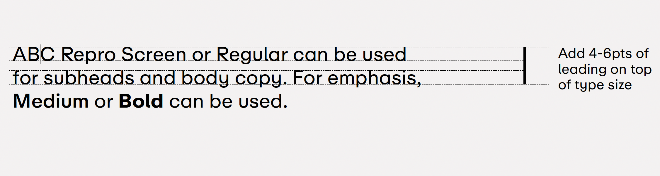
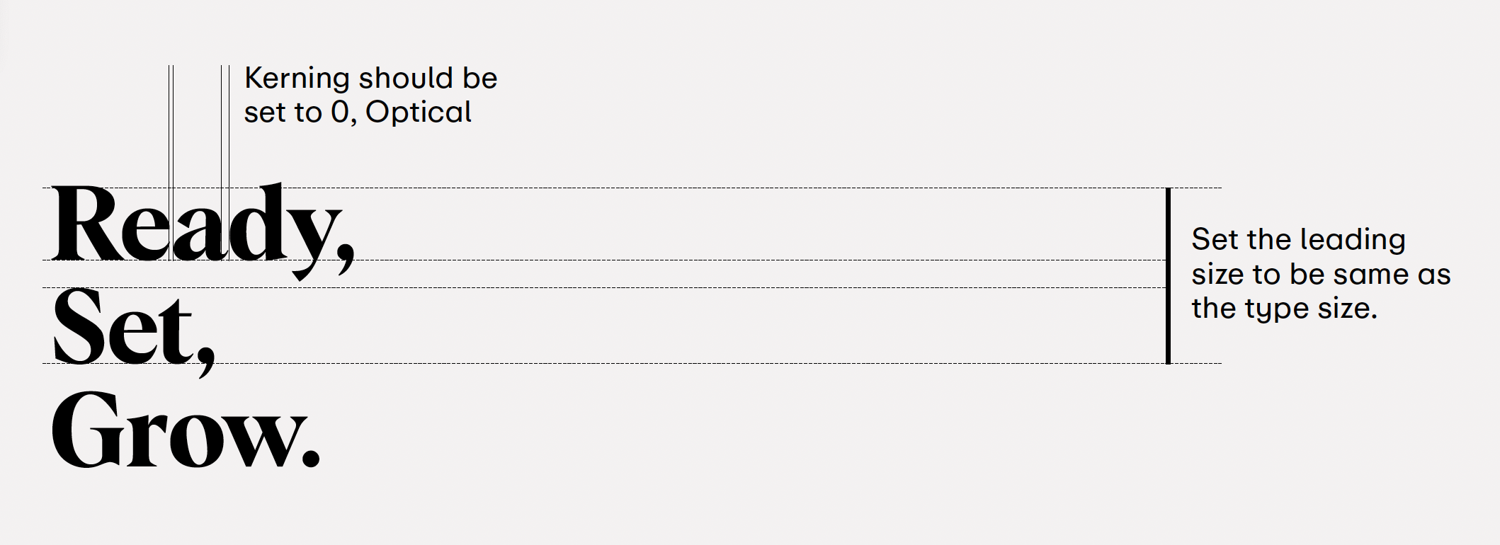
Leading
Leading refers to the vertical space between lines,
and is sometimes referred to as ‘Line height’.
Leading is always tight in the case of headlines,
while slightly more relaxed leading is more appropriate for
bodies of text that are smaller in size.
Things to avoid